6 Scattershot


Scattershot – G1, Combiner Wars (2016) & Unite Warriors (2016)

The remolding on the chest of the Takara version clinches it as the definitive Scattershot in my mind. I also like the color choices on the lower legs.

The Hasbro version more closely resembles the color scheme on the original figure. I like the colors on the chest piece but still falls short because of its lack of remolding.


5 Ironhide

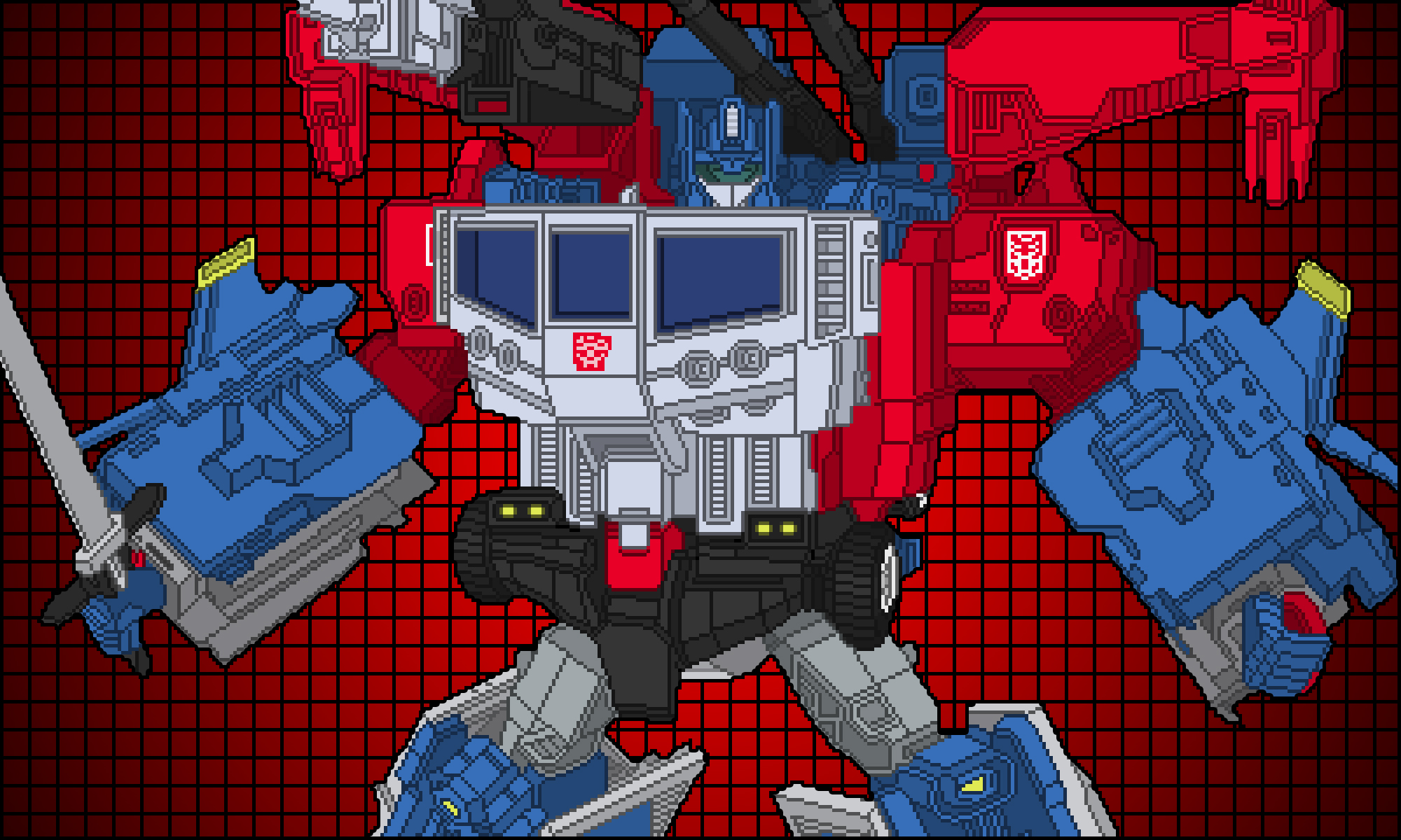
Ironhide – G1, Universe (2008), Henkei (2008) & Poneley Edition

There is a lot to like (and dislike) in both versions of this Ironhide mold.

Ironhide Hasbro Universe. The black on the forearms and legs really pops and makes this version stand out. Unfortunately the blue face really ruins it. I also prefer the clear headlights on the Takara version over the blue ones on the Hasbro edition.

Ironhide Takara Henkei. Takara contuously designs their figures to resemble the animated versions and this follows that pattern. Evidence of this is on the grey shoulders, which look okay. The best feature of this version is the yellow accents on the panels. Takara re-released this mold later in a exclusive boxed set. That version is not included here because it uses the same paint scheme.

Ironhide Poneley Edition. This is my version and the uses the best elements of the other two. It does not mirror the G1 animation color scheme but I think the black really helps the design pop. The yellow accents are a small but absolutely necessary detail.

4 Pounce & Wingspan

Pounce & Wingspan – Hasbro [Titans Return 2017]vs Takara [Legends 2018]

I really dig the color choices on both sets but the Hasbro versions have a slightly more interesting visual color scheme.

3 Megatron

Megatron – G1, Classics (2005), Henkei (2008), United (2010) & Platinum (2016)

The color choices on all four versions look great but my favorite remains the Takara United version because it resembles G1 the most.

Megatron Hasbro Classics. The colors definitely invoke a comic book Joker/Green Goblin aesthetic and that’s not a bad thing. I think a small improvement would be to replace the orange elements with yellow.

Megatron Hasbro Platinum Edition. When Hasbro decided to re-release this design I think they wisely chose to give it new colors and these new colors look great. They actually make me think of Beast Wars Megatron’s red dragon form and I wonder if that was the intent. I might be a bigger fan of this revision then the original.

Megatron Takara Henkei. The color scheme evokes G1 Megatron but with added flourishes of red. I have mixed feelings on some of these red highlights. I think the red on the shoulders and wrist gauntlets make the design too busy and takes away from an overall clean look. Although I do like the red on the barrel of the arm cannon, feet and “wings.”

Megatron Takara United. The best color scheme of the bunch. I can’t think of anything I would like to change on it.


1 Optimus Prime

Optimus Prime [G1] vs Optimus Prime [Hasbro Classics 2006] & Convoy [Takara Henkei 2008]

A great revision to G1 Optimus. Notable differences between the original cartoon design and the Henkei figure:

  • Samurai helmet influence on the head. The thick ear pieces, that resembled communications equipment, were toned down and ornamental details on the front face were added. The crown appears more ornamental and less like radio antennas. This Optimus looks like a shogun instead of a communications officer in a modern military.
  • Double badges on the shoulders. I prefer the single badge on the left shoulder of the original design. But this mirrors the double shoulder badges on the first Optimus figure. It’s more symmetrical but too busy.
  • Triangle shoulders. The revised shoulders somewhat resemble football shoulder pads and emphasize musculature and athleticism. The difference makes Henkei Optimus look physically stronger when compared to the very boxy G1 design. This reflects Hasbro and Takara’s “action figure” design aesthetic.
  • Lack of smokestacks on the shoulders. The smokestacks were a very iconic element in the original design so it is noticeable that they are missing. I don’t consider this a flaw though just a different design choice.
  • Anthropomorphized chest and abdomen. The design successfully keeps the original window chest and grill abdomen elements while slimming them down to more human-like proportions.
  • New arm gauntlets. A portion of the cab now forms into arm gauntlets. I have mixed feelings about this. It’s an interesting addition but it also looks like leftover kibble.
  • Grey tubing on the forearms. I like how this breaks up the solid red color of the arms.
  • Belt design on the abdomen. The original abdomen design looked more like a giant diaper. This is a successful revision.
  • Blue hand guards. These almost resemble like karate gloves. Nice addition that continues the “action figure” design aesthetic.
  • New laser cannons from the smokestacks. A very effective way to incorporate his weapon into his alt-mode. The cannon designs have an interesting “shotgun/rifle” design too.
  • Stretched out codpiece with no accent color. I don’t miss the blue codpiece on the original design. It needlessly pulled your attention on the Optimus’ robotic crotch.
  • Knee plates/guards with yellow accents. Fun addition. The yellow helps break up the sea of blue on the leg.
  • Lack of fuel tanks on the legs. I miss these! But it’s not a detrimental design decision to not include them. It’s just different.
  • New thigh elements. Instead of recessed spaces there are no cylinders that somewhat resemble a pulley on a tow truck. I like the change.   
  • Grey shin vents. Further helps break up color in the leg.

Overall a very successful redesign. The arm gauntlets are the biggest questionable design choice but also fit into the more “action figure” aesthetic. The samurai helmet, arm gauntlets, knee plates and hand guards show Optimus as a warrior ready for battle.

Inaugural First Post!

Welcome to my pixel art blog! The focus is Transformers art and the plan is for there to be updates twice a week. I hope you visit regularly and enjoy the art!

I will soon have a downloads page where you can download large versions of my art.