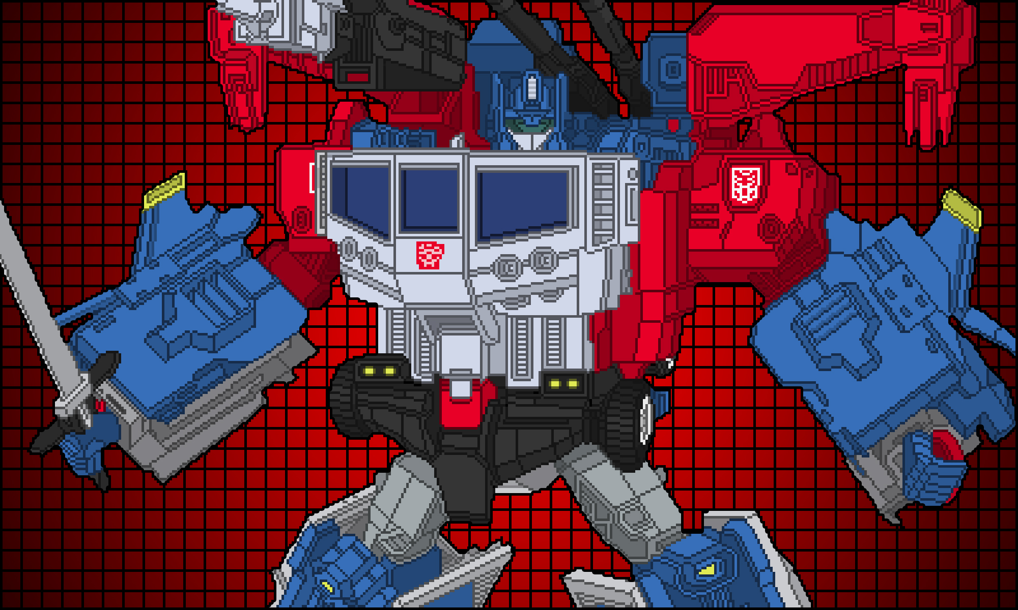
1 Optimus Prime


Optimus Prime [G1] vs Optimus Prime [Hasbro Classics 2006] & Convoy [Takara Henkei 2008]
A great revision to G1 Optimus. Notable differences between the original cartoon design and the Henkei figure:
- Samurai helmet influence on the head. The thick ear pieces, that resembled communications equipment, were toned down and ornamental details on the front face were added. The crown appears more ornamental and less like radio antennas. This Optimus looks like a shogun instead of a communications officer in a modern military.
- Double badges on the shoulders. I prefer the single badge on the left shoulder of the original design. But this mirrors the double shoulder badges on the first Optimus figure. It’s more symmetrical but too busy.
- Triangle shoulders. The revised shoulders somewhat resemble football shoulder pads and emphasize musculature and athleticism. The difference makes Henkei Optimus look physically stronger when compared to the very boxy G1 design. This reflects Hasbro and Takara’s “action figure” design aesthetic.
- Lack of smokestacks on the shoulders. The smokestacks were a very iconic element in the original design so it is noticeable that they are missing. I don’t consider this a flaw though just a different design choice.
- Anthropomorphized chest and abdomen. The design successfully keeps the original window chest and grill abdomen elements while slimming them down to more human-like proportions.
- New arm gauntlets. A portion of the cab now forms into arm gauntlets. I have mixed feelings about this. It’s an interesting addition but it also looks like leftover kibble.
- Grey tubing on the forearms. I like how this breaks up the solid red color of the arms.
- Belt design on the abdomen. The original abdomen design looked more like a giant diaper. This is a successful revision.
- Blue hand guards. These almost resemble like karate gloves. Nice addition that continues the “action figure” design aesthetic.
- New laser cannons from the smokestacks. A very effective way to incorporate his weapon into his alt-mode. The cannon designs have an interesting “shotgun/rifle” design too.
- Stretched out codpiece with no accent color. I don’t miss the blue codpiece on the original design. It needlessly pulled your attention on the Optimus’ robotic crotch.
- Knee plates/guards with yellow accents. Fun addition. The yellow helps break up the sea of blue on the leg.
- Lack of fuel tanks on the legs. I miss these! But it’s not a detrimental design decision to not include them. It’s just different.
- New thigh elements. Instead of recessed spaces there are no cylinders that somewhat resemble a pulley on a tow truck. I like the change.
- Grey shin vents. Further helps break up color in the leg.
Overall a very successful redesign. The arm gauntlets are the biggest questionable design choice but also fit into the more “action figure” aesthetic. The samurai helmet, arm gauntlets, knee plates and hand guards show Optimus as a warrior ready for battle.

