

Sideswipe – G1, Universe (2008) & Henkei (2008)


Transformers Pixel Art & GANIRON BEAT'EM UP
Where you can bust some bots!


Sideswipe – G1, Universe (2008) & Henkei (2008)


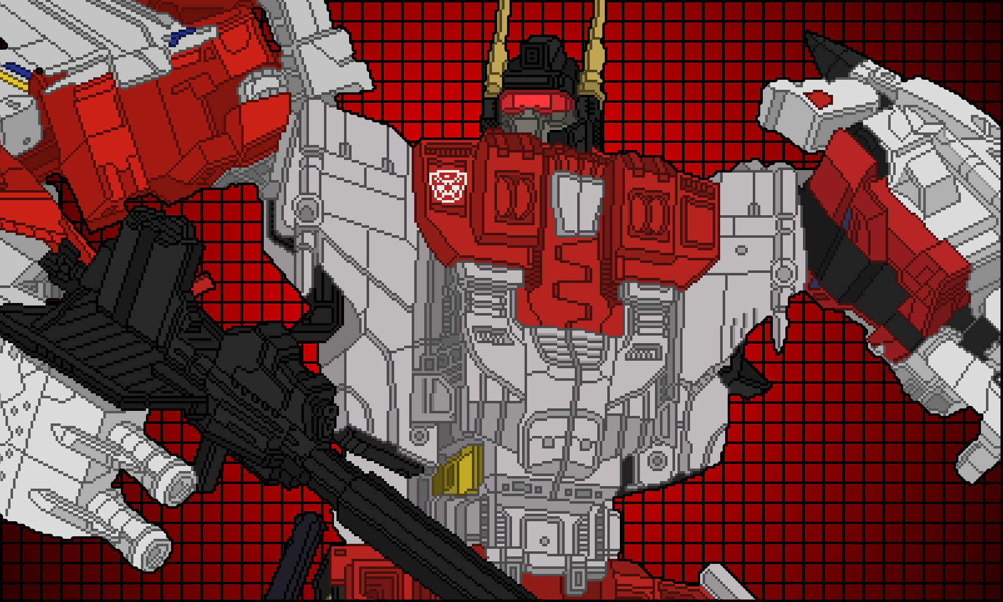
Skywarp – G1, Classics (2006), Henkei (2008), United (2012) & Poneley Edition


Thundercracker – BotCon (2007), Generations (2011), Henkel (2008), United (2012) & Poneley Edition


Ratchet – G1, Universe (2009), Henkei (2009) & Poneley Edition


Starscream – G1, Classics (2006), Universe (2009), Henkei (2008), United (2012) & Poneley


Prowl – G1, Universe (2008) & Henkei (2008)
The differences between the Hasbro and Takara versions are minor and mostly revolve around the use of some chrome. The Henkei version uses chrome on the rear spoiler, shoulder cannons and gun. I prefer the black gun on the Hasbro version.


Ironhide – G1, Universe (2008), Henkei (2008) & Poneley Edition
There is a lot to like (and dislike) in both versions of this Ironhide mold.
Ironhide Hasbro Universe. The black on the forearms and legs really pops and makes this version stand out. Unfortunately the blue face really ruins it. I also prefer the clear headlights on the Takara version over the blue ones on the Hasbro edition.
Ironhide Takara Henkei. Takara contuously designs their figures to resemble the animated versions and this follows that pattern. Evidence of this is on the grey shoulders, which look okay. The best feature of this version is the yellow accents on the panels. Takara re-released this mold later in a exclusive boxed set. That version is not included here because it uses the same paint scheme.
Ironhide Poneley Edition. This is my version and the uses the best elements of the other two. It does not mirror the G1 animation color scheme but I think the black really helps the design pop. The yellow accents are a small but absolutely necessary detail.


The color choices on all four versions look great but my favorite remains the Takara United version because it resembles G1 the most.
Megatron Hasbro Classics. The colors definitely invoke a comic book Joker/Green Goblin aesthetic and that’s not a bad thing. I think a small improvement would be to replace the orange elements with yellow.
Megatron Hasbro Platinum Edition. When Hasbro decided to re-release this design I think they wisely chose to give it new colors and these new colors look great. They actually make me think of Beast Wars Megatron’s red dragon form and I wonder if that was the intent. I might be a bigger fan of this revision then the original.
Megatron Takara Henkei. The color scheme evokes G1 Megatron but with added flourishes of red. I have mixed feelings on some of these red highlights. I think the red on the shoulders and wrist gauntlets make the design too busy and takes away from an overall clean look. Although I do like the red on the barrel of the arm cannon, feet and “wings.”
Megatron Takara United. The best color scheme of the bunch. I can’t think of anything I would like to change on it.


Optimus Prime [G1] vs Optimus Prime [Hasbro Classics 2006] & Convoy [Takara Henkei 2008]
A great revision to G1 Optimus. Notable differences between the original cartoon design and the Henkei figure:
Overall a very successful redesign. The arm gauntlets are the biggest questionable design choice but also fit into the more “action figure” aesthetic. The samurai helmet, arm gauntlets, knee plates and hand guards show Optimus as a warrior ready for battle.